Part 3 of a set of posts which explore various aspects and offshoots of Brutalist architecture. (Visit Part 1 here and Part 2 here.)
In Part 2 of these posts I discussed some of the potential problems and reasons for them that have been related to Brutalist architecture, particularly in relation to its use in housing design; connected to which I mentioned the work of writer J. G. Ballard.
His novel High-Rise (1975) is an iconic fictional account of extreme dysfunction that occurs in a modern tower block.
In the book there is a vertical division of class within a tower block, with inhabitants who live on floors 1-9 being members of the “proletariat” and those who generally work in the support and service aspects of work/the creative industries. Above them is a commercial level and then higher up the middle classes, with the top five floors being reserved for the upper class which consists of “a discreet oligarchy of minor tycoons and entrepreneurs, television actresses and career academics”.
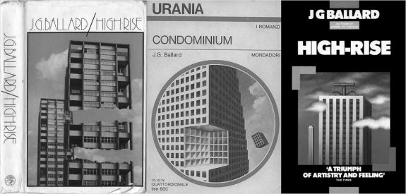
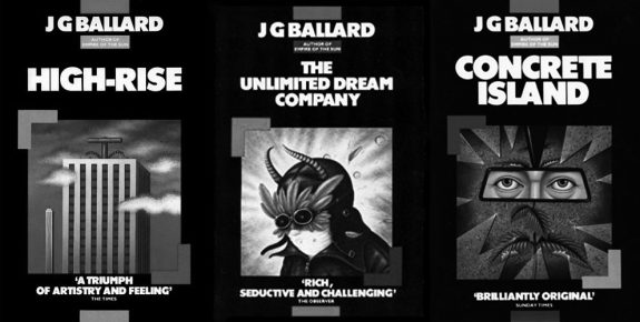
(As an aside the covers at the top of this post are left-right; the original edition of High Rise, an issue of Italian science fiction magazine Urania which featured High Rise and the 1985 British edition of the book; the artwork for this issue of Urania has alongside the use of Brutalist architecture forms, also the curious “the shape of the future’s past” retro-futurism look to it which science fiction and fantasy cover art from previous decades now seems to often have. The above cover of the 1985 edition, which is shown next to those for The Unlimited Dream Company and Concrete Island, was part of a series of reissues of J. G. Ballard’s book which shared cover art with similar aesthetics. Fittingly for the era I think they were probably created using airbrush art techniques and have a pleasing period look to them that could well be a flipside take on the posters which would have been found in the retail poster shop chain Athena, which had an extensive network of high street shops in the UK around that time.)
Returning to the story told in the novel; in it the eponymous high-rise becomes a self-enclosed community where the normal rules and restraints of society break down, leading to internecine territorial conflict and chaos, which could be considered not dissimilar to an urban take on William Golding’s novel Lord of the Flies (1954) in which a group of schoolboys stranded on an island descend into violence and tribalism; both books explore the push and pull between human impulses towards civilisation and social organisation and more basic, primal instincts.
In the novel of High-Rise social class and divisions play an increasing part but it is possible to consider it not as a comment or reflection on wider society but rather a fictional flight of fancy.Ben Wheatley’s 2014 film adaptation largely reflects this, although at the end of the film in a slightly tacked-on manner a speech by right-wing former British Prime Minister from the 1970s is heard. This connects the story more overtly to both the social unrest/conflict in 1970s British society at the time the novel was written (essentially between those who looked more towards a progressive state orientated welfare based society and a new more individualistic monetarist right) and also to the utopian impulses which lay behind some of Brutalist architecture:
“There is only one economic system in this world, and it is capitalism. Where there is state capitalism, there will never be political freedom.” Margaret Thatcher speech, as featured in Ben Wheatley’s High-Rise.
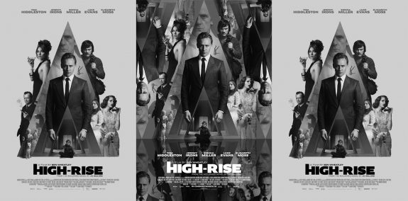
In their use of a central triangular design the above set of above film posters for High Rise explicitly references the poster design for Stanley Kubrick’s 1971 film adaptation of Anthony Burgess’ A Clockwork Orange, with both films and books sharing views of dystopian futures where pleasure-seeking tips over into a reprehensible and unfettered decadence and loss of conventional morality.
The above poster for High Rise on the left I think was released in the film’s pre-production period and at a time when I first became aware of the film after seeing it posted along with Ben Wheatley’s comments which went along the lines of “I can’t believe this is happening” – I assume after being given the go ahead from the folks with the money.
The design of the tower block references the Brutalist architecture of the period when the novel was first published in 1975 and also appears to be a nod towards that period’s left-of-centre exploratory science fiction cover art, which was also referred to earlier in the post.
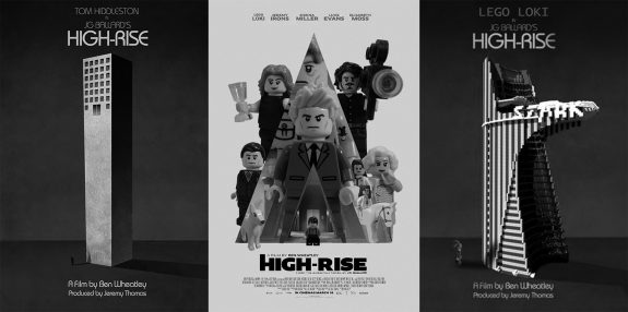
To end this post on a note that is not all heavy cultural reference points etc, the other two posters are Lego toy construction brick recreations of the film’s posters by somebody working as Lego Loki. Although there now appear to be on the internet Lego recreations of nearly everything under the sun, due to Lego’s origin as a child’s toy, I was still a little surprised to find ones which took as their source material something as experimentally transgressive as High-Rise.
Elsewhere:
- The High-Rise novel at Wikipedia
- The High-Rise novel
- The High-Rise trailer
- The High Rise home release
- Lego Loki’s Brick High-Rise
Elsewhere at A Year In The Country:
- Reflections on Brutalism Part 1 – This Brutal World and a Study of The Shape of the Futures Past: Wanderings 14/52
- Reflections on Brutalism Part 2 – This Brutal World, Industrial Inspirations for Blade Runner, Memories of the Space Age and the Future Takes a Tumble: Wanderings 15/52


